

Symbolic of new beginnings, Pantone chose Greenery as the color of 2016. This may be in response to the tumultuous year the world has seen in 2016.
![]()
According to Leatrice Eiseman, Executive Director of Pantone:
“Greenery bursts forth in 2017 to provide us with reassurance we yearn for amid a tumultuous social and political environment. Satisfying our growing desire to rejuvenate and revitalize, Greenery symbolizes the reconnection we seek with nature, one another, and a larger purpose.”
The color is a yellow-green shade and represents spring when nature revives, restores, and renews. According to Pantone, as we further submerge ourselves in modern life, it’s important to still immerse ourselves in the natural beauty of the world. They describe the shade as life-affirming and that it represents the pursuit of personal passions and vitality.
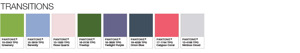
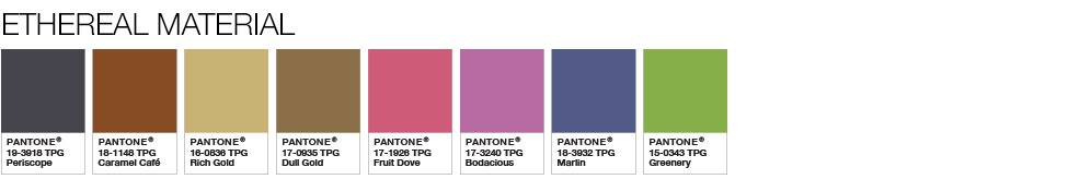
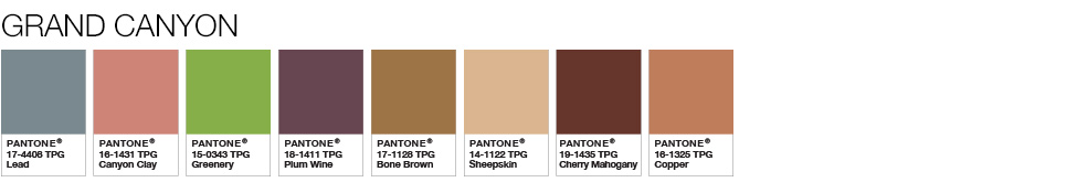
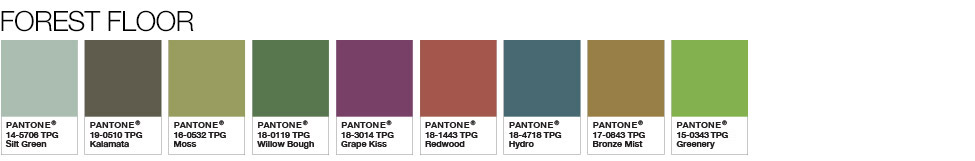
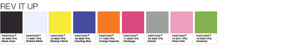
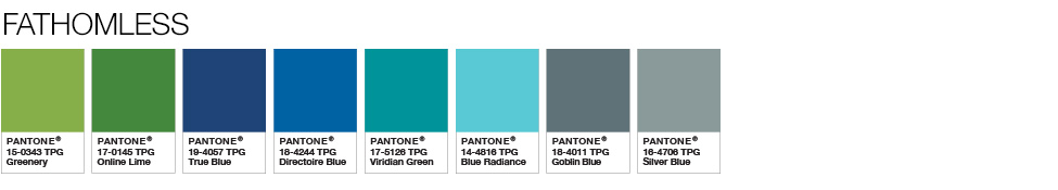
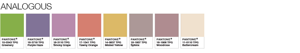
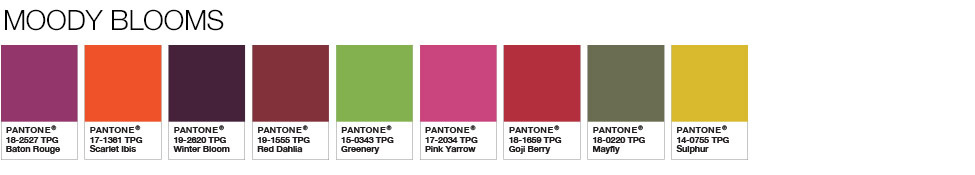
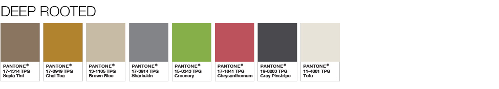
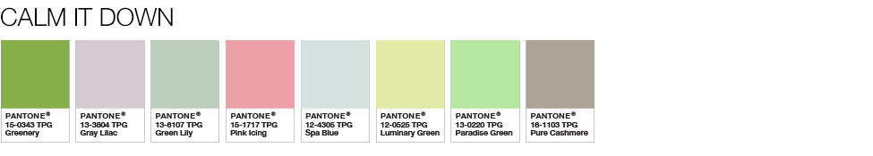
Potential Pairings
Greenery is “nature’s neutral” and is a versatile, trans-seasonal shade. The 10 palettes below pair greenery with neutrals, brights, deep shades, metallics, pastels, and the 2016 Pantone Color of the Year (Rose Quartz and Serenity).
Reactions to Greenery
Reactions to the new color have been mixed.
We live in stressful times so Pantone declares ‘greenery’ the colour of 2017. Seems appropriate.https://t.co/CC55VwJm6G
— neal lamontagne (@nlamontagne) December 8, 2016
Pantone please release whatever yoga poses/crystals/mantras you’re using to not let existential dread set in https://t.co/Q1yotnQzOo pic.twitter.com/wRgDg3ivX6
— Lori McCue (@LoriMcCue) December 8, 2016
Pantone’s colour of the year 2017 is literally Kermit-green and if that isn’t the high of this year I don’t know what is pic.twitter.com/xrDoREMHVe
— Joppe DC (@joppe_dc) December 8, 2016
We’ve got the #ColorOfTheYear on our mind. #Greenery pic.twitter.com/R5asgQmuNd
— FedEx (@FedEx) December 8, 2016
Nice try @pantone. We already know the #coloroftheyear. pic.twitter.com/3eOgsAmC6U
— Jenna Giles (@jennagiles) December 8, 2016
Pantone is trying to be fancy with “greenery” when their color of the year is literally just G train green pic.twitter.com/Dcx99WAWVZ
— Maeve McDermott (@maeve_mcdermott) December 8, 2016
Will You Use Greenery this Year?
Color is critical to design. Embracing the trends is important, but think twice before using a Color of the Year for something permanent, like a logo. It may work tremendously if it fits with your brand’s message, but picking it up just because it’s trendy right now may make you outdated in a few years.
