

Every year, IDeas BIG likes to discuss the Pantone Color of the Year and how it can be used in your branding and marketing efforts.
This year’s Pantone Color of the Year, however, surprised many of us with something Pantone has never done before. For the first time ever, not one, but two colors were announced for 2016. Rose Quartz, 13-1520 and Serenity, 15-3919 were chosen to demonstrate a balance between warm and cool tones. Similarly, the feminine and masculine colors also strike a balance between genders.
Let’s face it, no one was impressed by last year’s Pantone Color of the Year, Marsala. The color was meant to “feed your soul” and be versatile for both men and women, but it didn’t translate that way to many people.
Pantone’s choice to combine two colors has a symbolic meaning that leaves everyone happy with the selection. In the video posted below, the combination of Rose Quartz and Serenity, symbolizes a mood and an attitude that reminds consumers to relax during modern day stresses.
“This more unilateral approach to color is coinciding with societal movements toward gender equality and fluidity, the consumer’s increased comfort with using color as a form of expression, a generation that has less concern about being typecast or judged and an open exchange of digital information that has opened our eyes to different approaches to color usage.”
Rose Quartz and Serenity will be seen in many areas of branding and marketing including the fashion industry for Spring 2016.
Rose Quartz & Serenity Color Pairings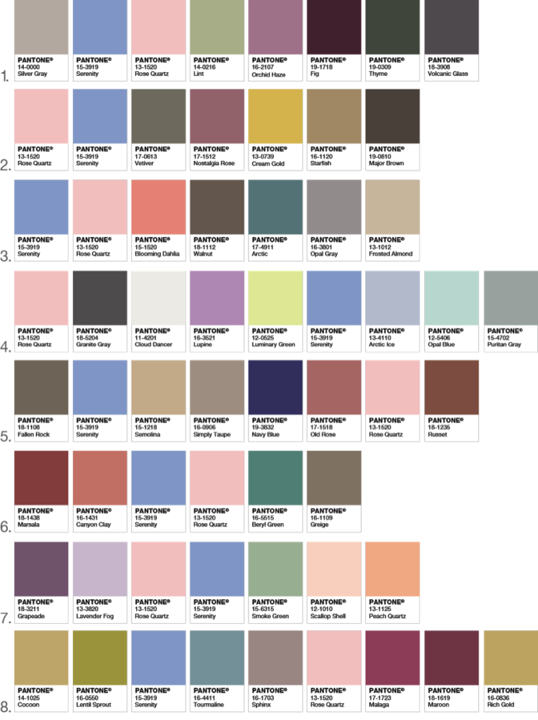
Should Pantone Rose Quartz and Serenity be Part of your Marketing Campaign?
Color is a very critical factor in making a marketing campaign successful and to distinguish brands from one another. To learn more about What Can Color Do For You, check out our older blog posts.
The most popular global brands lean on color consultations for brand identity and meaning to better communicate their brand message through color. However, it’s important to define your brand with the help of brand experts, before making a drastic color change.
The brand developers at IDeas BIG (brand identity group) offer a complimentary BRAND AUDIT. Contact Chief Branding Officer Neil Brown for details. Please share this blog with the social tools below, and certainly your perspective using the comment box.
Related Articles
1 Comment
Pingbacks
-
[…] 10 palettes below pair greenery with neutrals, brights, deep shades, metallics, pastels, and the 2016 Pantone Color of the Year (Rose Quartz and […]