
Behind the successful merger between American Airlines and US Airways, was a successful rebranding program, with the two brands following their now-combined vision of “Building the New American.”
Dropping the AA Logo
Although a symbol of American Airlines for over 40 years; the eagle and AA logo of old was one of the biggest things American needed to modernize. After placing the largest airplane order in airline history, the update couldn’t have come at a better time. With many of the new planes using composite material, the mirror shine that American had used was impossible to recreate.
AA Logo to Flight Symbol
In a move to modernize the brand image, American took the culture of the AA Logo into complete consideration when designing the new ‘Flight Symbol.’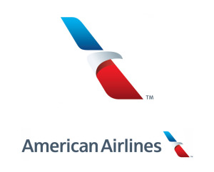
Originally designed in 1968 by Massimo Vignelli, the AA logo was a minimalistic concept that was one of the most recognizable and iconic logos not only in the airline industry, but in the history of any branding. The simplicity and recognizance needed to be duplicated, and themes of this logo needed to be brought into the new American Logo.
With a move to the “Flight Symbol,” designed by FutureBrand; American creates an image of moving forward with its new partnership. Moving forward is the entire concept of the rebrand, growing from the bankruptcy proceedings and poor user experience ratings of old.
The new Flight symbol is a simplistic addition, bringing together all aspects of former American Airlines Logos. The color scheme is refreshed as well; reflecting a more modern and welcoming American Airlines. It brings together things that people believe not only represent American, but America in general.
New Livery Design
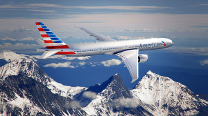 In addition to the new logo, the entirety of the livery has been redesigned to create a new feel to the entire aircraft. In the redesign, Futurebrand’s research took into consideration what factors would portray American without spelling blindly patriotic global disaster. In this, Futurebrand chose to use an abstraction of red, white, and blue stripes that demonstrated movement even while standing still.
Flying above the Bankruptcy
You will see a lot of ‘new’ in the American campaigns. This is not only a move to dispel the concerns with customer service, lost baggage, and PR disasters; but with the 2011 Bankruptcy proceedings that American has hopefully dispelled upon reentering the NASDAQ as a publically traded company on 9 December 2013 upon the ticker symbol AAL.
This move comes to set up American as the largest airline carrier globally; operating 6,700 flights to over 330 destinations each day and employing over 100,000 employees.
The New American
There are many things besides the bankruptcy that American hopes to dispel through the merger. Some of the things that have plagued the airline have been included customer service complaints, employee management disdain, and Public Relations issues.
With the forward-thinking campaign of ‘The New American,’ the goal is to rise above all of the issues in a unified way. Committed to modernizing the travel experience, American will focus on improving the product and service from ordering tickets to arrival.
In-Flight Renovation
In addition to the changes that will be made to the corporate structure, American is focusing on the onboarding and in-flight experiences that will build customer value. From an all-aisle and lie-flat business class seating option to inflight Wi-Fi that includes charging ports for each seat; American is focusing its rebranding on the customer experience.
This renovation goes for the staff as well; as for the first time in 20 years, American has redesigned flight attendant attire to combine function and fashion. In addition to the new uniforms, American has focused on improving staff knowledge by bringing together an all-new training program and technological advances for the entirety of the staff.
Improved Interaction through Social Media
Part of the growth of American is the addition of an around-the-clock social media team to assist with customer service issues and other complaints.
Conclusion: The Successes of American Rebranding
The entirety of the ‘New American Airlines” comes as a welcome change to the longstanding issues that have plagued the brand. By introducing a new staff training program, improving the entirety of the experience from booking to arrival, and improving the corporate outlook; American has successfully developed itself as an improved company, from user to investor.
This rebranding was revolutionary, and focused on every single problem that had plagued the company. Taking a strategic approach to air travel, American has proven that like the phoenix, the American Airlines Eagle can rise from the ashes.
Even if your branding or rebranding campaign isn’t as large-scale as American’s, you still will need the assistance of trusted brand experts. The brand developers at IDeas BIG (brand identity group) offer a complimentary BRAND AUDIT. Contact Chief Branding Officer Neil Brown for details.
Please share this blog with the social tools below, and certainly your perspective on this blog using the comment box.
Related Articles


5 Comments
Pingbacks
-
[…] to the study, YouGov also offers a study on the Most Improved Brand Perceptions of 2013 including American Airlines, Goldman Sachs, and Bank of […]
-
[…] Related Rebranding News: The New American Airlines […]
-
[…] American Rebranding: A Case Study […]
-
[…] Related: The New American […]
-
[…] Related Rebranding News: The New American: A Rebranding Case Study […]