We’ve seen it all before and know that most social networks like Facebook, Twitter and LinkedIn all have blue logos. Since this blue phenomenon took over social media sites, we also see blue being used in IT software, marketing tools, music streaming apps and other startup websites.
IDeas BIG has put together a list websites that use 50 shades of blue and why this color is sexy on the Internet.
Why Blue is a Sexy Color on the Internet
As branding experts, we know how important color is to a brand and logo design. Blue is certainly a growing trend on many websites and app logos. But this trend didn’t just happen out of the blue.
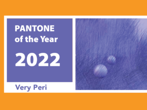
Back in 2000, Pantone announced Cerulean Blue 15-4020 as the Color of the Year or “Color of the Millennium.” Why was this color was chosen? Well it’s scientifically proven that the color blue has a calming effect on our moods and what better way to enter into the millennium than with a calming color. Blue also brings a sense of peace and can lower blood pressure and heart rate.
Although, that doesn’t quite explain why Mark Zuckerberg chose blue for Facebook’s logo and website, it is coincidentally the right choice. In an interview with The New Yorker, he stated that he’s colorblind and cannot see red and green colors. “Blue is the richest color for me. I can see all of blue,” stated Zuckerberg.
So it makes sense why blue is the color of choice. Besides being seen by people who are colorblind, it is also the same color as the sky, water and all things comforting. Blue even symbolizes safety, trust, the mind and sleep. Below are a few reasons why blue attracts customers to a website:
- Attract with a welcoming color. A blue website wants its viewers to feel welcome. They are stepping into a friendly environment that is not intimidating nor boring.
- Portray safety and reliability. With the primary color of a website being blue, the website is thus designed to whisper to the customer, “Look how reliable I am. I am safe, as well as both light-hearted and professional. I am comfortable. Look at me.”
- Disappear into background. Now that the color has done what it was designed to do, it can now take a few steps back to allow the reader to become completely enveloped in the information they are receiving. How often do you pay attention to the blue borders of your Facebook window or the sidebars of Microsoft Office? Exactly.
Now, more than 50 websites use the color blue for its branding and it’s hard to tell the difference between the different shades of blue. You can even test yourself to see how well you recognize blue brands.
For examples on why blue is a sexy color, check out the list of 50 websites that use a shade of blue in its logo:
AOL
App Store
Atlassian
Behance
Box
Delicious
Dell
Digg
Diigo
Diigolet
Disqus
Dropbox
Drupal
Engadget
Foursquare
Friend Feed
GitHub
Hootsuite
IBM
iTunes
Intel
Internet Explorer
Mailbox
MailChimp
Mashable
Mention
Metafilter
Microsoft
Pandora
PayPal
Rdio
Safari
Skype
Stripe
Swiftly
Tailwind
Tapiture
Trello
Tumblr
Vimeo
Vkontakte
Wistia
WordPress
Wykop
Yammer
Blue in Your Web Design?
Look for color ideas for your web design? Blue is perceived as calm, comfortable, and a reliable color and if that’s how you want your brand to be portrayed, then the color blue is good choice. However, any color will work for a website when used in an efficient way, but if you are looking to portray the specifics of communication, then blue seems to be the way to go.
Should you design your brand using this color? Are you looking to rebrand in the future? Please Comment, Bookmark, or Share with your colleagues using the tools below.
1 Comment
Pingbacks
-
[…] Breanne: At Facebook, in the position that they call “content strategist,” they have this focus on microcopy. They are usually UX writers whose jobs are just to focus on button text, but the scale has to be that big and that profit-driven to create that kind of focus. Otherwise, no one is going to pay such close attention to button text or 50 shades of blue. […]


