

And the 2022 Color of the Year is… PANTONE 17-3938 Very Peri. Displaying a carefree confidence and a daring curiosity that animates our creative spirit, inquisitive and intriguing PANTONE 17-3938 Very Peri helps us to embrace this altered landscape of possibilities, opening us up to a new vision as we rewrite our lives. Rekindling gratitude for some of the qualities that blue represents complemented by a new perspective that resonates today, PANTONE 17-3938 Very Peri places the future ahead in a new light.
We are living in transformative times. PANTONE 17-3938 Very Peri is a symbol of the global zeitgeist of the moment and the transition we are going through. As we emerge from an intense period of isolation, our notions and standards are changing, and our physical and digital lives have merged in new ways. Digital design helps us to stretch the limits of reality, opening the door to a dynamic virtual world where we can explore and create new color possibilities. With trends in gaming, the expanding popularity of the metaverse and rising artistic community in the digital space PANTONE 17-3938 Very Peri illustrates the fusion of modern life and how color trends in the digital world are being manifested in the physical world and vice versa.
Potential Pairings
What colors go well with PANTONE 17-3938 Very Peri?
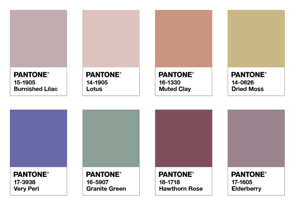
Balancing Act
Balancing Act is a complementary palette of colors whose natural balance of warm and cool tones support and enhance one other.
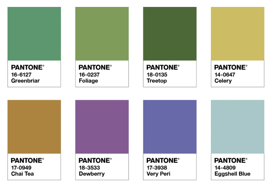
Wellspring
A holistic and harmonious blend of nature infused shades, Wellspring highlights the compatibility of the greens with good-natured PANTONE 17-3938 Very Peri.
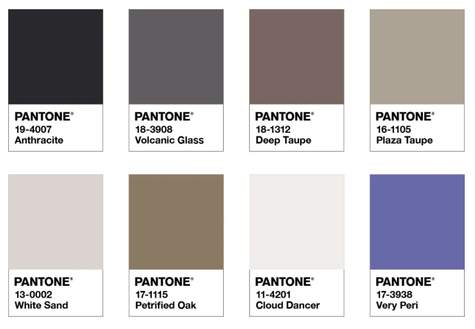
The Star of the Show
The Star of the Show is the happiest and warmest of all the blue hues with a palette of classics and neutrals whose essence of elegance and understated stylishness convey a message of timeless sophistication.
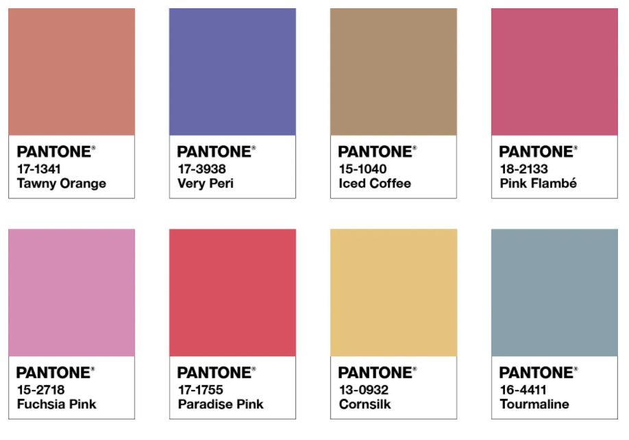
Amusements
Amusements, a joyous and whimsical color story of irrepressible fun and spontaneity is amplified by the carefree confidence and joyful attitude of PANTONE 17-3938 Very Peri.
Will You Use Very Peri This Year?
Does this color encourage you? Would you use it in any of your designs this year? Do you like that Pantone sees greater purpose in the colors it chooses? Let us know below.
Additional Color Resources
How Color Impacts Logos and Branding (IDeas BIG)
The Colors of Branding (Forbes)
Pantone Color of the Year 2021 (IDeas BIG)
