
And the color for 2018 is… Ultra Violet! Previous years have seen Rose Quartz and Serenity (2016) as a nod to the increasing blurring of genders and Greenery (2017) resembling a need for calm in the increasingly intense worldscape. So what meaning is Pantone striving for with Ultra Violet? Well, the shade was inspired by late music legends Prince, Jimi Hendrix, and David Bowie who helped make purple a prominent color in pop culture. The unique musicians represent creativity and nonconformity, which is the intention behind this Color of the Year. Learn more about what Pantone has to say about its color below.
Why Has Pantone Strived Towards Sharing Colors with Meaning?
“The Pantone Color of the Year has come to mean so much more than ‘what’s trending’ in the world of design; it’s truly a reflection of what’s needed in our world today.” – Laurie Pressman, Vice President of the Pantone Color Institute.
As individuals around the world become more fascinated with color and realize its ability to convey deep messages and meanings, designers and brands should feel empowered to use color to inspire and influence. The Color of the Year is one moment in time that provides strategic direction for the world of trend and design, reflecting the Pantone Color Institute’s year-round work doing the same for designers and brands.
Why Ultra Violet?
According to Pantone, Ultra Violet is “inventive and imaginative” and “lights the way to what is yet to come.” Here’s Pantone’s statement on Ultra Violet:
A dramatically provocative and thoughtful purple shade, PANTONE 18-3838 Ultra Violet communicates originality, ingenuity, and visionary thinking that points us toward the future.
Complex and contemplative, Ultra Violet suggests the mysteries of the cosmos, the intrigue of what lies ahead, and the discoveries beyond where we are now. The vast and limitless night sky is symbolic of what is possible and continues to inspire the desire to pursue a world beyond our own.
Enigmatic purples have also long been symbolic of counterculture, unconventionality, and artistic brilliance. Musical icons Prince, David Bowie, and Jimi Hendrix brought shades of Ultra Violet to the forefront of western pop culture as personal expressions of individuality. Nuanced and full of emotion, the depth of PANTONE 18-3838 Ultra Violet symbolizes experimentation and non-conformity, spurring individuals to imagine their unique mark on the world, and push boundaries through creative outlets.
Historically, there has been a mystical or spiritual quality attached to Ultra Violet. The color is often associated with mindfulness practices, which offer a higher ground to those seeking refuge from today’s over-stimulated world. The use of purple-toned lighting in meditation spaces and other gathering places energizes the communities that gather there and inspire connection.
How to Use Ultra Violet in Your Design
Pantone always puts together palettes to help you best use its chosen color. See their recommendations below.
Purple Haze
Embodying calmness, a palette of hazy and smoky hues effortlessly commingle to create subtle blends and harmonies that are both timeless and time-honored.
Kindred Spirits
Sitting side by side on the color wheel, this palette of like-minded hues with their spirited good humor and playful exuberance makes for easy and engaging color mixes.
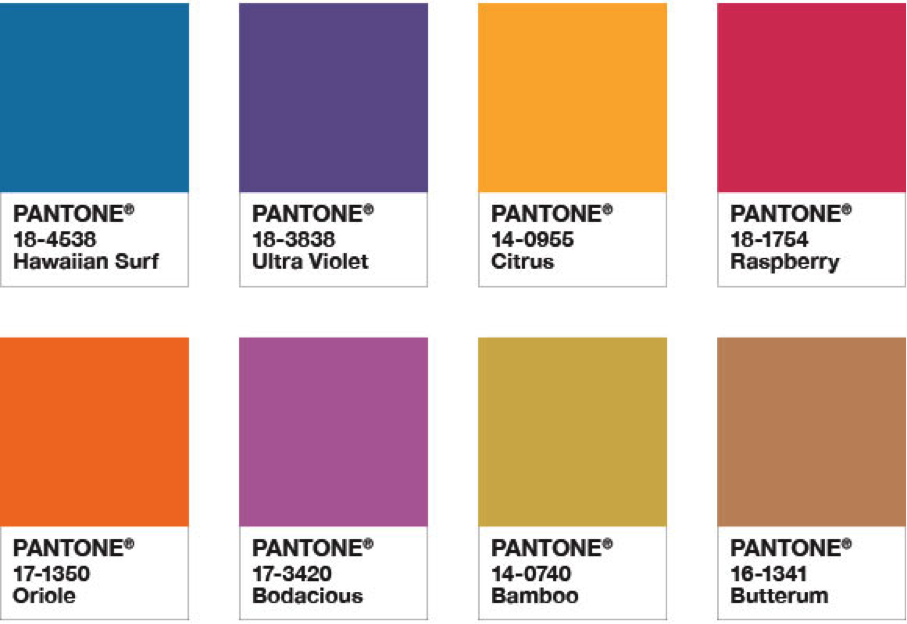
Drama Queen
An unusual combination of show-stopping saturated color with rich and elegant earth tones creates an adventurous mood full of excitement and drama.
Intrigue
Invoking a sense of mystery, a palette of nature’s blues and greens, combined with the unconventional Ultra Violet and a Silver and Pale Gold metallic, exudes a quiet strength.
Quietude
Soft and warm, a subtle palette of natural and organic shades accented by a Frosted Almond metallic evokes reassurance and conveys a sense of calm and quiet.
Attitude
Exploding with zest and energy, this palette of pure, unadulterated color which screams “look at me” comes together to create a bold statement with feelings of excitement and high voltage effects.
Desert Sunset
Emulating a desert sunset, this is a dramatic palette of brilliantly heightened warm shades that radiate resplendently across the early evening sky.
Floral Fantasies
Inspired by the colors we see in our surroundings, a combination of soft and sweet pastels with an enchanting Ultra Violet and a deep, dark navy Astral Aura conjures up a summer garden in full bloom.
What Do You Think of Ultra Violet?
Does it inspire you like intended? Would you use it in any of your designs this year? Do you like that Pantone sees greater purpose in the colors it chooses? Let us know below.
Want to learn more about UItra Violet? Check out these links:


