

Brands like Coca-Cola, Starbucks, Apple, and Google are some of the top, most recognizable brands. They’re easily identifiable, well-known globally, and enjoy a certain level of brand trust. Their success, in part, comes from their stellar branding. Looking at how these brands have changed over the years is fascinating, which is why we’ll look at their evolution today.
The 13 brands we’ll look at include:
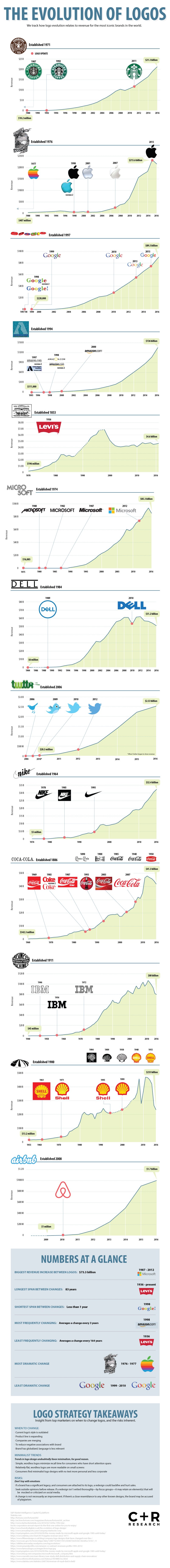
Starbucks: Up until 2011, the logo didn’t change too much. Minor changes were made a few times, but it was generally the mermaid in the center, with a surrounding border, usually in colors black and green.
Apple: While Apple’s initial logo was quite complex, they changed their logo a year later to the iconic apple we know today. Despite some color and other minor changes, the logo has remained familiar.
Google: Google changed its logo text a couple times during the first couple of years before settling on the familiar text we saw all the way into 2015. In 2015, Google refreshed with new text.
Amazon: Like Google (up until 2015), Amazon hasn’t changed its familiar logo this millennium. Although their first few iterations looked decidely different, one look has stuck and stayed ever since.
Levi’s: You can’t beat Levi’s consistency. They’ve only changed their logo twice in over 160 years, and kept the iconic red Levi’s logo since 1936.
Microsoft: While most tech companies stayed generally the same with their simplistic logos over the years, Microsoft has tried some edgier, trendier text for their logos. Accordingly, they had to adapt when it got outdated.
Dell: Conversely, Dell follows the trend of other tech companies’ relatively consistent logos. They did make the text bolder and dropped the circle border in 2010, but it’s not vastly different.
Twitter: For the most part, Twitter’s logo has always been a blue bird, made increasingly simplistic throughout the years.
Nike: Nike kept with its black-and-white color scheme and ”swoosh”, though some stylistic and text changes have been made.
Coca-Cola: Coca-Cola has strayed from its cursive writing a couple times, but inevitably came back to it. Red has been a fixture since 1950 and beyond.
IBM: IBM’s logo was once far more complicated than the simplistic, bold text logo it has now. Other than some text fill changes, the logo has remained relatively the same, like other tech companies.
Shell: It’s no surprise that Shell has always kept a shell as a fixture in their logo, but they have adjusted it quite a bit.
Airbnb: Check out Airbnb’s original logo. The company changed it for the better in 2010.
See the logos themselves below:
The Best Logos Were Consistent
Interestingly, few made crazy changes to their logo. This is likely because they’ve always been strong brands. Making major changes to an easily identifiable and successful brand image would be a mistake. That’s not to say that businesses should be completely stagnant, but unless you’re shedding some negative image, learn from the greats and be consistent.


